We Build Distinct Commerce
Shopify Plus
Development Agency
We're a certified Shopify Plus development agency specializing in custom Shopify and BigCommerce builds, seamless platform migrations, powerful ERP integrations, and B2B ecommerce solutions, helping mid-sized brands scale faster.
ECommerce Partners is a certified Shopify Plus development agency based in Tenafly, New Jersey, serving ecommerce brands across the United States since 1998. With over 25 years of experience and 100+ successful projects, we are one of the most experienced Shopify development agencies in the New York metro area. Our team specializes in Shopify Plus and BigCommerce custom development, B2B wholesale solutions, platform migrations from Magento, BigCommerce, and WooCommerce, ERP integrations with NetSuite, SAP, and AS400 systems, and performance optimization. We are a certified Shopify Plus Partner with verified skills in Shopify Development Fundamentals, Liquid Storefronts, and B2B on Shopify. Notable clients include Chantecaille, QC Supply, C.O. Bigelow, Sabon, PayJoy, KOL Foods, and Eberjey.
Brands We Work With





Client Case Studies
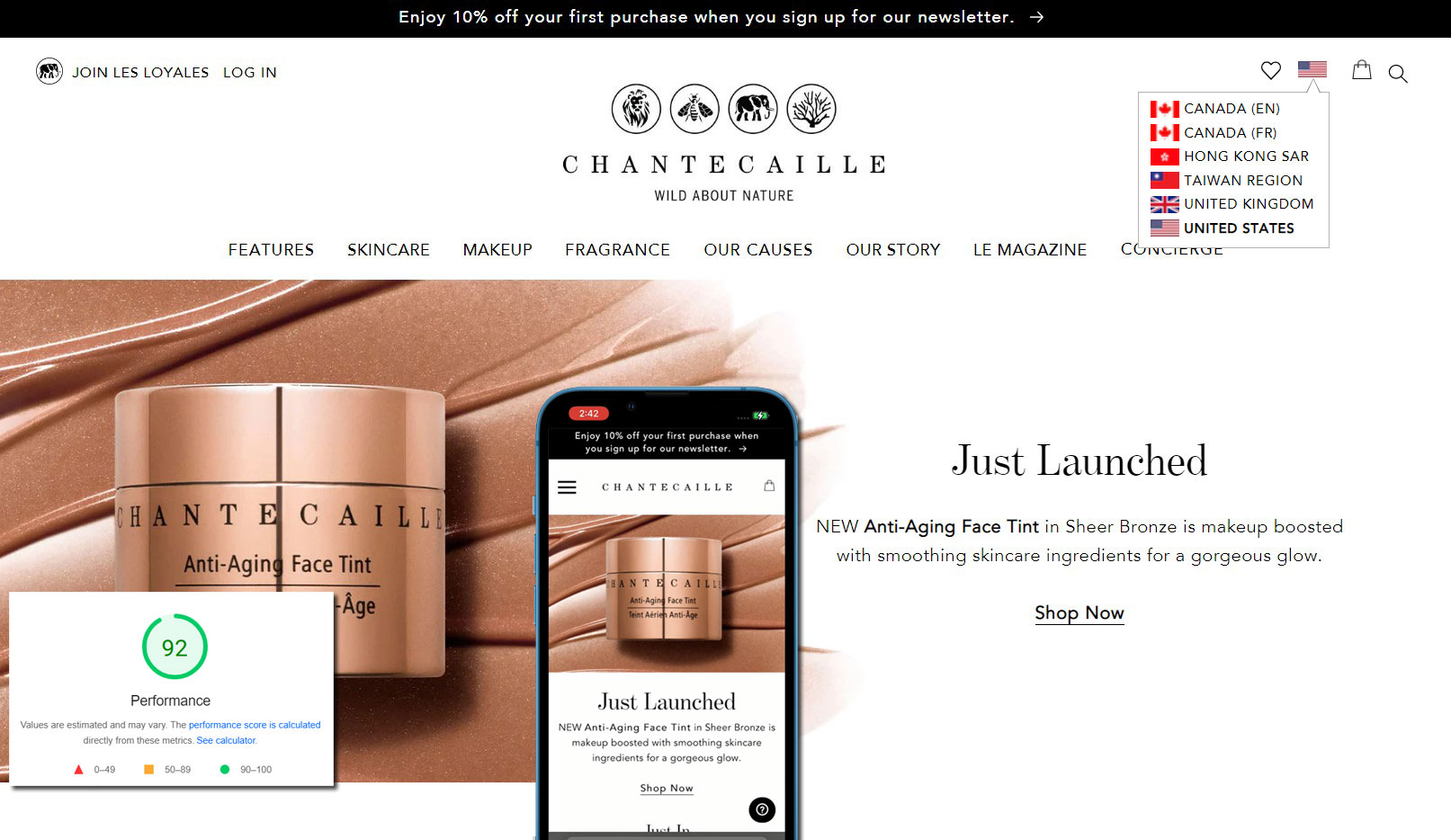
Chantecaille
Multiple international stores with ERP integration, 50% sales growth.
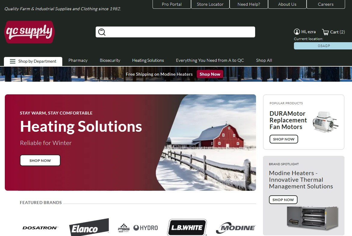
QC Supply
Magento to Shopify Plus migration with custom B2B portal.
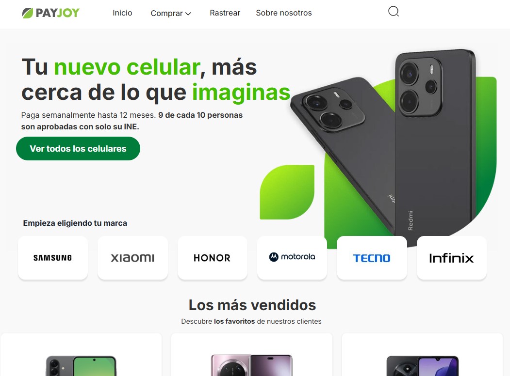
PayJoy
Legacy to BigCommerce replatform with custom checkout and financing API integration.
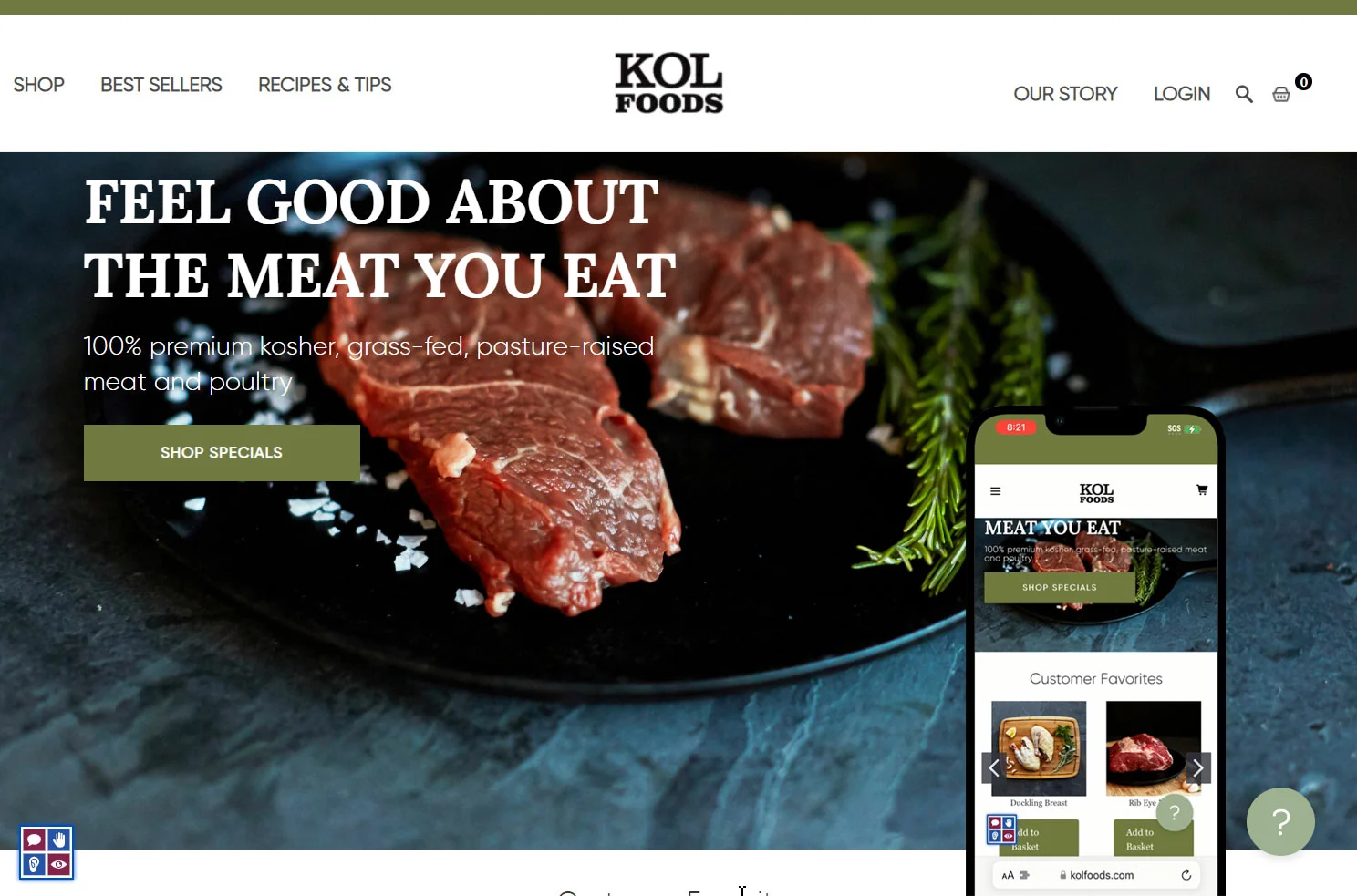
KOL Foods
Custom ERP integration with AS400, real-time pricing management.
Full-Stack Shopify Plus Development
From new store builds to complex migrations, here's everything we do for ecommerce brands.
Shopify Plus Development
Advanced builds with custom checkout scripts, Shopify Flow automation, and multi-store setups for high-volume growth.
Shopify B2B Solutions
Complete B2B ecommerce with company accounts, custom pricing, payment terms, and wholesale catalog management.
Shopify Markets
International expansion with multi-currency support, localized content, and regional pricing strategies.
Custom Theme Development
Pixel-perfect, performance-optimized, ADA compliant themes built from scratch for your brand.
Platform Migration
Seamless migrations from Magento, BigCommerce, or WooCommerce with zero data loss and full SEO preservation.
ERP Integration
Connect with NetSuite, Microsoft Business Central, SAP. Real-time sync, custom middleware, order automation.
Why Growing Brands Choose Shopify Plus Development
Shopify Plus powers over 47,000 merchants worldwide with enterprise infrastructure that handles 10,978 checkouts per minute. For brands doing $1M+ in annual revenue, it unlocks capabilities that standard Shopify and competing platforms simply can't match.
As certified Shopify Plus Partners, we help merchants take full advantage of exclusive Plus features — from checkout extensibility and Shopify Functions to expansion stores and wholesale channels that aren't available on standard plans.
Shopify Plus handles the world's highest-traffic events. Black Friday, flash sales, product drops; the platform doesn't break.
"We were looking for someone who could work with all the challenges in our existing setup and do the best with what we had."
, Frederick, Kirrin Finch
Custom Checkout Pages
Complete control over your checkout experience. Match your brand, add custom fields, and optimize for 20-30% better conversion rates.
Automation That Saves Time
Shopify Flow and Launchpad handle repetitive tasks automatically. Tag VIP customers, manage inventory alerts, and launch sales while you sleep.
B2B + B2C Together
Sell to businesses and consumers from one platform. Special pricing, minimum orders, payment terms built-in.
Shopify B2B Development Solutions
Transform your wholesale operations with powerful B2B features built natively into Shopify Plus
Complete B2B Ecommerce Solutions
If you sell to other businesses as well as regular customers, Shopify Plus makes it easy to manage both B2B and B2C sales from a single platform.
Company Accounts & Locations
Set up company accounts with multiple users, locations, and permission levels.
Custom Pricing & Catalogs
Create customer-specific pricing, volume discounts, and exclusive product catalogs.
Payment Terms & Net Payment
Offer Net 30, Net 60 payment terms to qualified customers.
Bulk Ordering & Quick Order Forms
Enable quick reordering, bulk order entry by SKU, and order templates.
B2B Portal Features
"The B2B portal transformed how our dealers order. They love the self-service capability."
, Becky Morrison, QC Supply
B2B Pro Portal App
Shopify App StoreWe built our own Shopify app to extend native B2B functionality with true customer self-service. Now available on the Shopify App Store for any Shopify Plus merchant!
What It Does:
- Company main contacts manage their own users without merchant intervention
- Add, remove, and manage shipping locations independently
- Set location-based permissions per user with granular control
- Built on Shopify's new customer account system
- Works with native Shopify B2B features (Companies, Catalogs, Locations)
Business Benefits:
- Reduce support tickets: Customers handle user/location management themselves
- Faster onboarding: New B2B customers get access immediately
- Better customer experience: True self-service portal
- Seamless integration: Works perfectly with Shopify Plus B2B
- Only $19/month: Affordable for any B2B business
Shopify Migration Services: Magento, BigCommerce & WooCommerce
Moving from Magento, BigCommerce, WooCommerce, or a custom platform? We've migrated 100+ stores with zero data loss.
Magento to Shopify
Escape high maintenance costs and technical debt. We've migrated stores with 50,000+ SKUs.
- Complex B2B features preserved
- Large catalog optimization
- Custom extension recreation
BigCommerce to Shopify
Unlock better app ecosystem and easier customization while maintaining enterprise features.
- Multi-storefront migration
- Variant complexity handling
- API integration maintenance
WooCommerce to Shopify
Say goodbye to plugin conflicts and hosting headaches. Get enterprise-grade infrastructure.
- WordPress blog integration
- Membership features recreation
- Payment gateway migration
Our Migration Process
Audit & Planning
Complete analysis of your current platform and data structure
Data Migration
Products, customers, orders moved with automated tools and QA
Feature Recreation
Rebuild custom functionality using Shopify apps or custom code
SEO & Launch
301 redirects and careful launch to maintain search rankings
Shopify Performance Optimization & Ongoing Support
Every second of load time costs you sales. We optimize Shopify stores for lightning-fast performance.
PageSpeed Score
We consistently achieve 90+ scores on Google PageSpeed Insights for both mobile and desktop.
Load Time
Sub-2-second load times. Every 100ms improvement increases conversions by 1%.
Support
Round-the-clock monitoring means critical issues get resolved immediately.
What We Optimize
Image Optimization
WebP conversion, lazy loading, responsive images without quality loss.
Code Cleanup
Remove unused CSS/JS and optimize critical rendering path.
App Audit
Review installed apps and remove/replace bloated apps.
Ongoing Support Plans
Monthly Retainer
Popular- Dedicated hours each month
- Priority response times
- Proactive monitoring
- Regular updates & improvements
Emergency Support
Site down? We treat emergencies with top priority and resolve critical issues within hours.
Why Choose ECommerce Partners as Your Shopify Development Agency
We don't just work together; we grow together.
Proven Track Record
Our portfolio spans diverse industries, consistently delivering measurable results and long-term client success.
Hands-On Technical Expertise
10+ years mastering Shopify. We craft custom code and deploy advanced features for flawless performance.
Really Fast & Friendly
We communicate directly with a nimble approach, so you never get lost in the red tape of a big agency.
Scalable for Mid-Sized Complexity
Expertise to tackle complex projects while keeping solutions cost-effective for growing businesses.
Flexible Engagements
Choose the model that fits: hourly retainers, project-based work, or phased approaches.
Trusted Partnership
We become your long-term development partner, supporting and growing your Shopify store as your business evolves.
What Our Shopify Development Clients Say
Real stories from real partnerships

Becky Morrison
Director of E-Commerce, QC Supply
"Ecommerce Partners is professional, knowledgeable, and flexible. They were super patient. I really appreciated that partnership."

Frederick McDavid
Ecommerce Director, Kirrin Finch
"Communication has been great. The package feels tailored to exactly what I'm looking for."
In situations where we needed something done more quickly we would give that to Ecommerce Partners because they were able to be more responsive and act more quickly.
Paul Goodman
Head of eCommerce & DTC
We went with them because of a general feeling of trust based on what they showed us and their technical capacity. They came with ideas that sounded right.
Gidon Van Emden
CEO, Kol Foods
I love those guys. They are a solid team and the big thing is that they care. No matter when, if we had a problem, they're all over it.
Ian Ginsberg
President, C.O. Bigelow
These People Trust Us
What our clients say about working with us
My team and I have had an exceptional experience working with E-commerce partners. Ezra has supported each project with professionalism and a solutions-focused approach. The developments have directly contributed to our continued growth and UX.
In situations where we needed something done more quickly and efficiently we would give that to Ecommerce Partners because they were able to be more responsive and act more quickly.
Ecommerce Partners is professional, knowledgeable, and flexible. Those were the big three things that I really leaned on. They were super patient and I really appreciated that partnership.
We've worked with Ecommerce Partners for over three years, they're basically our outsourced IT department. Ezra and the team are good at helping figure out what you need vs what you want.
We chose to work with them because of their extensive ecommerce knowledge, top quality customer support, business savvy and their technical expertise.
Working with ECP has been very helpful as they are very knowledgeable about BigCommerce. They were very patient with me, and are available to answer any questions. I highly recommend ECP.
ECommerce Partners provides a very professional and very prompt service. We are very happy with the results of their work and would recommend them to other websites.
Ecommerce Partners looks at themselves as Partners with Sabon, not just service providers. Every person we work with really does care like they are our partners.
One of our core values is quick response time. It's been great working with Ecommerce Partners because they are available 24/7, is proactive, and efficient with their time.
Meet Our Shopify Development Team
At Ecommerce Partners, our journey began with a simple idea: even the most complex eCommerce challenges can be solved with genuine expertise, a friendly approach, and a healthy dose of coffee-fueled creativity.
What started as intimate brainstorming sessions among a small team has grown into trusted partnerships with mid-sized eCommerce businesses. We don't aggressively push contracts; we earn your trust with transparent communication, honest scoping, and by always keeping our promises.
Our mission is to empower mid-sized eCommerce businesses with expert, flexible, and trustworthy development solutions, delivered through responsive, hands-on partnerships.
Let's build something extraordinary together!
While Shopify Plus is our primary platform, we also deliver enterprise-grade BigCommerce development for brands that need it, bringing the same hands-on expertise and partnership approach to every project.

Ezra Adler
Managing Director
Project Management Wizard

Maksym Kalamarz
Head Developer
Shopify Guru

Magdalena Jasinska
Product Manager
Design Maestro
Shopify Verified Skills & Certifications
Shopify Development Fundamentals
Liquid Storefronts for Theme Developers
B2B on Shopify: Launch & Customization
Shopify Development FAQ
Can't find the answer? Fill out the contact form below.
Why hire a Shopify expert instead of doing it myself?
While Shopify is user-friendly for basic setup, scaling requires technical expertise. We bring years of experience so tasks that might take days can be done in hours.
How long does it take to build a Shopify store?
A simple store can launch in weeks. A fully custom Shopify Plus build typically takes 8-12 weeks from kickoff to launch.
Can you help with an existing Shopify store?
Absolutely. We do comprehensive audits - theme code, app setup, speed, SEO - and then execute improvements.
How much does it cost?
We offer flexible engagement - hourly retainers, project-based, or phased approaches. Transparent pricing within your budget.
Do you offer ongoing support after launch?
Yes! Ongoing retainer packages, emergency support, and continuous optimization. Many client relationships span years.
What platforms can you migrate from?
Magento, BigCommerce, WooCommerce, and others. We handle data, SEO, URL redirects, and custom functionality rebuilds.
Hire a Shopify Plus
Development Agency
Get a free Shopify development consultation from certified Shopify Plus experts. We typically respond within a few hours.
Latest from the Blog

The Font Formats Slowing Down Your Shopify Store
Legacy font formats like EOT, TTF, and WOFF may be silently hurting your store's page speed. Here's how to audit and fix them.

Lightspeed vs Shopify POS: Which POS Is Right for Your Business?
A detailed comparison of Lightspeed and Shopify POS — pricing, features, hardware, and which system fits different business needs.

Universal Commerce Protocol (UCP): How Shopify, Google & AI Are Reshaping Ecommerce
A new open standard by Shopify and Google that connects merchants, AI agents, and platforms through a unified product-discovery layer.